6 of the Worst Web Browser Features
There comes a time when browser developers decide to implement a specific feature or do things in certain way that may cripple user experience.
So, lets dig into this mess and find out, what these things actually are.
Internet Explorer: Connecting

Turns out, such simple task as opening new tab, can also become a headache. If you’ve been using Internet Explorer 7/8, then infamous “Connecting…” message is already wired into your brain.
Furthermore, the more add-ons you have – the longer this message stays.
Why would developers code IE in such way? I don’t know. It’s certainly not a fashion thing.
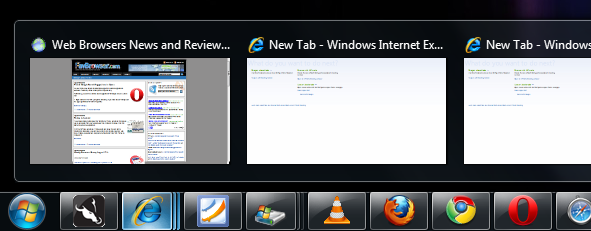
Internet Explorer, Safari: Windows 7 Thumbnail Previews

Now, this can either be your best friend or become your worst enemy. If you constantly surf just a few web pages, it could be a useful thing. However, what about those, who have 10-20 tabs opened at once? Not a good idea.
Maybe Microsoft thinks that if IE user decides to open multiple pages, he/she will certainly not be using Internet Explorer?
Apple has implemented the very same thing into Safari 5 web browser as well.
Fortunately, other web browser vendors turns this feature off by default.
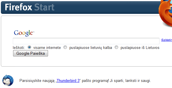
Firefox: Start Page

What’s the use of Firefox start page when you can already type keywords into address bar or use Search Box? Do we really need 3 different ways for the very same thing? I guess so, otherwise, why would Mozilla do that?
Also, start page displays Google in local language. This might sound like a good idea. However, when Google.com and Google.lt (in my case) displays completely different results (.lt is less accurate), I chose not to use it.
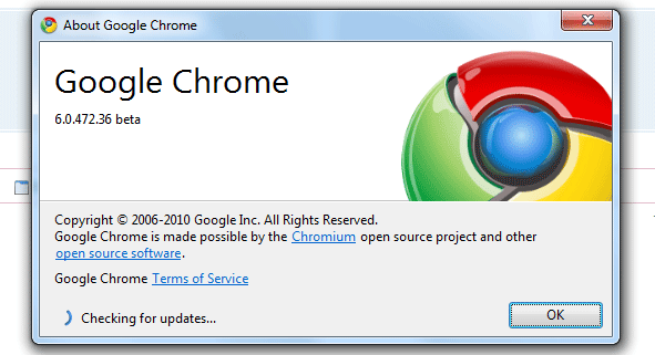
Google Chrome: Updates

If you are a Google Chrome user, then checking for updates works like this:
Menu > About Google Chrome
What “About” has to do with browser updates? Still trying to figure it out. It’s weird that company like Google would decide not to implement “check for updates on startup” feature or include “check for updates” as a separate option in the menu.
Update: It should be noted that Chrome checks for updates during startup and updates everything silently, except for beta builds.
Opera: Blue Dots

Opera blue dots feature suffer from the very same issue as Internet Explorer and Safari Windows 7 integration does: it becomes a headache when surfing multiple pages.
What happens when you resume your browsing session with 10-20 opened tabs? Tab bar becomes a mess, with dozens of useless blue dots indicating that page has “changed/loaded”, which is obvious anyway. The worst part? You can’t turn this feature off.
Why is this better than the old fashioned way (tab text color change)? I don’t know.
Safari: Top Sites

Either I am not too smart to be using Apple products or it’s just a bad feature implementation.
How do you add new pages into Safari’s “Top Sites”? According to text message below it, just drag its address (URL) to this window.
Here’s how I tried to add a new site:
1. Drag/drop other tab into Top Sites window. Final result? It just shifted position.
2. Opened other tab, marked URL and tried to drag/drop it into Top Sites window. Final result? It opened that URL over the Top Sites tab.
3. Unintalled Safari and tried different browser. This option worked fine.
Why can’t we just have something similar to Opera’s Speed Dial approach (click / right click > edit)? Guess we’ll never know OR this is just a nasty bug.
Conclusion
In the end, it comes down to personal user preference. Some do enjoy tab thumbnails, blue dots, “Connecting…” messages and find Safari’s Top Sites approach more than obvious, while others do not
Anything else? Let us know!
[digg-reddit-me]
About (Author Profile)
Vygantas is a former web designer whose projects are used by companies such as AMD, NVIDIA and departed Westood Studios. Being passionate about software, Vygantas began his journalism career back in 2007 when he founded FavBrowser.com. Having said that, he is also an adrenaline junkie who enjoys good books, fitness activities and Forex trading.


“Firefox: Start Page” and “Opera: Blue Dots” really aren’t issues. They are hyperboles.
As Opera user i hate those dots
Why is that?
find them useless + no way to disable
it easy to disable them – just change the skin (I recommend Opera Clean, or Z1 glass if you like this kind of eye candy)
I prefer OperaClean’s approach to signaling that a tab is loaded (slight tab color change) but I think Blue Dots are better than simple text color change as when you have 30+ tabs you don’t see their titles
Exactly, george. Those blue dots are probably the least obtrusive way to indicate that a tab has not been checked out yet.
I personally would love to see an option to disable them as well, via opera:config, for example.
I think the dots are great. But you can turn them off by using a different skin.
As Opera user I love blue dots :)
Definitively the least obtrusive way to indicate that something changed.
Tab TEXT color won’t do it if you have more then 25 tabs open (only icons are visible). Blue tabs are tiny, and I don’t mind them. I even find it useful when – I always know (after for example having Opera on for few hours) what page was not visited yet.
Alternatives? Blinking? That would be an nightmare, tab background change – personally I think its worse solution, but I could accept it.
I’d say shrinking the tabs down to only their icons is the most obtrusive way to handle tab overflow.
There is an option in Opera to keep fixed size of a tab, but then you loose vertical space. There is an option do do it as in firefox, but then you don’t see all tabs. Icons mostly works well (sites tend to have their own favicons), and besides I can always use preview to find out what is under some tab.
One of the greatest things in Opera is that you can customize almost everything as you want :)
Oh, and I do use window manager if I want to find specific tab (cause I have at least 3 windows opened all the time).
So no, I don’t really see a problem. And dots are helpful for me. But as mentioned – one can use different skin.
My Dots are better than yours
Well that was kind of an unexpected result.
Fixed!
Thank You
That’s pretty nice as well. Is it part of the skin? Which skin is it?
I MUST have that theme,it’s amazing.
So kids let me give you some backstorry.
This is a modified theme based on a theme based on a theme.
Original creator AV69 – check him out at Opera skins.
Klaster1 is responsible for the second iteration.
And the one you see here is courtesy of CraigPD.
Enough me blabbering.
Firstly – Download http://files.myopera.com/CraigPD/skin/zit-mod-1_24.zip
Place this in C:\Users\<USER NAME>\AppData\Roaming\Opera\Opera\skin
Restart Opera and select the theme from the appearance menu as per usual.
Enjoy
Was it a waste to post this?
Wheres my thanks you good for nothing leeches
Barghhh!
Thanks!
Your welcome
I haven’t yet bothered to check it out so I refuse to thank you. For now. >:-(
Well I like the blue dots. Why do you hate those blue dots?
Yes this dots are not so usefull…but it is not icluede in a list :)
They are a simple, discrete way of telling you that you have not viewed a recently loaded page. It’s far better than changing the font of the title of a tab in my opinion, which Opera used to do and Firefox extensions Tabberwocky and Tab Mix Plus still do. Some browsers don’t even bother telling the user. I myself am a power user and have lots of tabs open at a time. I always miss the blue dots when I decide to attempt my daily browsing on Chrome or Firefox to see if any significant progress has been made with an update.
Agree with whole list
I figured out Safari’s speed dial – you have to have two windows open, one with top sites, the other with the page you want to add, and then grab marked URL of favicon to the grid
Sort of obvious, but: by window, you mean two separate windows, right? Not tabs.
Yes, windows. It’s like copying a file between two folders in windows – if you have them both open, you can simply drag&drop the icon. If you have one maximized you can drag the icon to the taskbar so the target folder comes to view. What Safari is lacking is this ability to change focus to top sites tab. As you said it just changes position
I know this is 7 months old, but just mentioning that the other way to add them is to hit the + to the left of the URL.
The most annoying feature for me is the popup blocking in IE. There are times when i enter my username and password and the login page opens in a new tab. But in IE, i get a message saying Popup blocker is enabled. Then i have to go through a complicated process of disabling the popup blocker for a little time and then reload the page and then type the username and password again. That is the most stupid way to implement a popup blocker.
In Opera, for instance, there is a notification saying a popup has been blocked. If i want to open it, i just click on the notification and it opens in a new tab. If not , I just ignore it. So simple and elegant.
Guess it only affects you then.
:)
Really? Set your popup blocker settings to high and then try to open a popup in IE. It displays a message at the top saying a popup has been blocked. You have no option to see what popup has been blocked. All you can do is enable popups for that site and then reload the page and try again.
I think you didnt quite get it.
Non of us use IE hence why it will only affect you
:)
Hahaha Good one. I’m an Opera user but have to use IE6 at work for some tasks ( luckily, I can still use Opera at work for normal browsing ) .
The problem with using text or tab colours to indicate status is the the skin is completely at the mercy of the colour scheme you have in use – and more importantly, not every user has the visual acuity to distinguish between colours of text.
Hello fellow aussie/english person.
Dear author, don’t you know about Windows Google Update Service?
I am. Yes, that’s my mistake. Somehow I forgot about it, maybe cause it’s silent and I am used to other browser update methods :-)
Sometimes Cover Flow in Safari can be annoying because, a) I’m not running iTunes I just want to surf the net and 2) unnecessary bloat is added to Safari.
Speaking of annoying, I find Chrome’s tab overflow bug VERY annoying (why would any browser maker forget people might have 80+ tabs open at once?)
Because it’s ridiculous?
Which one: the 80+ tabs or the Cover Flow?
80+ tabs.
I very often open batches of links from sites using the “Links” tool. The blue tabs are great because you can go straight to loaded pages.
i like so much the blue dots of opera tabs!!!!
I hate IE Conecting shite. I love the dot’s of Opera.
Mainly use Firefox and Chrome for day-to-day browsing, so I rarely notice issues in IE, since it’s usually only for Windows updates or the odd site that was written specifically for IE. I hardly notice the blue dots in Opera, so I generally consider them useless. With regard to Chrome, my biggest complaint is that they leave old versions behind in a neighboring directory after silently upgrading. I’d like for it to clean up after itself.
I cant see why anyone should have 20 or 30 or more tabs open at once. I must be a sad so n so.
Like millions of others, I have seen reference to blue dots, I use Opera and as I have only two or three tabs open they do not come into focus but when you do notice them they can be useful. Keep them on for us oldies and let the real sados worry about them.
the blue dots in opera can be turned off. i’ve had them turned off ever since they implemented them
actually, its this very site that told me how to remove them
http://www.favbrowser.com/how-to-remove-opera-small-blue-dots-near-tabs/
Well, the only thing I “hate” is IE in general and the connect stuff is just 0.5% of all the problems…
The rest of the features are, imho, very usefull. Although I do agree that there should be an easy way to enable/disable them, without installing extensions.
Chrome will update by auto when next big version comes out, check the facts first.
Yes i agree with blue dots on Opera, they are useless, they also had green and red sometime ago. Firefox 4 has progress pie on tab, that will make more sense.
About thumbnails from Windows if someone noticed that are just for show and they not sync with browser gui it self, just Firefox 4 is doing things right.
I cind of agree with Johan de Jong. I “HATE” Internet Explorer (and that’s all I don’t like of the browsers). Internet Explorer has friends, but 85% of it is it’s OWN kind. Like, IE, IE2, IE3, IE4, IE5, IE6, IE7, IE8, IE9 beta. The 25 other percent is MSN, Microsoft, Windows, Windows Vista, Windows 7, Windows 2000, Windows 9999, and about all Microsoft stuff.
Never noticed the blue dots before, I guess they’re gonna drive me nuts now… Thanks!
(.Y.)