Download Firefox 25 Pre-Alpha With UI Changes
 Another Chrome clone in the making.
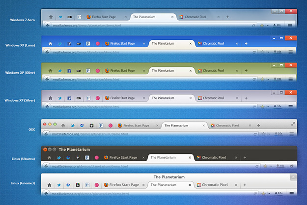
Back in 2012, Mozilla promised to overhaul the overall UI in the upcoming Firefox 19 release (see screenshot below). Well, that did not happen.
Now, it looks like someone from Mozilla has finally decided to deliver these promised changes with Firefox 25, which is set to be released in the fourth quarter of 2013.
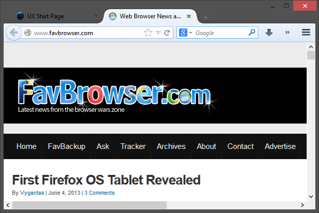
Available in the UX Nightly channel, Firefox 25 includes Google Chrome like tabs and currently looks like this (which is a huge problem if you are using a dark Windows 8 skin):
According to TNW, Firefox 25 is set to also include the following UI changes:
– Remove tab affordance from background tabs.
– Separate Bookmark Star from locationBar and merge with Bookmarks Menu item.
– Updated Panel Based Application Menu and Customization Mode.
– Windows (All): Draw entire window frame including Caption Buttons.
– Windows XP: Custom window frame style for all default themes.
What do you guys think?
Download
Firefox 25 Pre-Alpha
About (Author Profile)
Vygantas is a former web designer whose projects are used by companies such as AMD, NVIDIA and departed Westood Studios. Being passionate about software, Vygantas began his journalism career back in 2007 when he founded FavBrowser.com. Having said that, he is also an adrenaline junkie who enjoys good books, fitness activities and Forex trading.


“Download Firefox 25 Pre-Alpha With UI Changes” Actually Firefox 25 is not available yet. Firefox 24 UX is a build of Firefox Nightly that contains UX experiments. Right now the UX build contains the Australis UI changes that will probably be coming in Firefox 25.
Are the guys at Mozilla completely incapable of coming up
with something original? This is so Chrome-like I feel like I’m being watched
just looking at it!
Check this out and tell me which one is better?
http://i.minus.com/iybdzewkakjg.bmp
Better is a point of view. Functionality is a matter of fact.
Which one is more functional? Neither.
You can customize Firefox by yourself to add or remove any icon that you want or need.
both looks designed for old people by the windows8’s designer. i see some kind of pattern here…
If I wanted my browser to look like Chrome, I’d use that piece of crap. Looks like the industry is finding it way back to IE vs everyone else. Personally, I like the way Firefox is laid out over Chrome. Craming everything up top into as little space as possible just for screen realistate is stupid. We’re talking about 5-10 pixels. It makes sense on mobile, where screens are small, but on my nice big desktop, its just dumb. There is a reason it didn’t make it into 19. Its a FAIL.
Firefox new UI looks even better than chromes UI
http://i.minus.com/iybdzewkakjg.bmp
Chrofox, Chropera, what else….
iechrome
I prefer ChromIE.
The UX channel has had this for at least 3 months. Even I remember using it back then.
unnecessary google bar
You can remove that by youself
http://i.minus.com/iybdzewkakjg.bmp
I don’t know why some people see Chrome in everything, for me this UI has nothing to do with Chrome.
It’s not so much that it looks like chrome – looks are arbitrary.
When Google set out to build Chrome, they decided to adopt a minimalist design philosophy.
They removed buttons and dialog boxes that may potentially confuse the
inexperienced user. Mozilla and other browser vendors have copied this philosophy, and hence made
their browser UI’s “Chrome-like” (i.e. minimalistic).
But how so?
Look at how Opera UI was before Chrome and after Chrome. (10.10 -> Chrome launch -> 10.50 all the way up to 12.15) it doesn’t look more like Chrome. I think the only difference is the way there’s a menu button at the top left corner (making Opera tabs which were already above the address bar to merge with the title bar). And you could aways use the address field for searching and remove the dedicated search field.
I don’t have the source but Firefox 4 UI is said to have been planned since before Chrome existed also (people actually said Fx copied Opera at the time and others said Opera copied Fx because of the similarity at the time, the releases were so close it caused confusion!)…
I don’t see how they became more minimalistic because of Chrome… The timeline doesn’t match and Opera stayed with its status bar (removable since a long time ago) for example… Now, IE9 is really very suspicious on adopting minimalism only after Chrome because we don’t have access to the internal UI designs they made between 2008 and 2011.
These things need to be observed over a longer period; not days, weeks and months, but years. So, yes, look at how Opera has changed following Chrome’s enormous success. They have gone beyond adopting simple minimalistic design principles, to actually building their browser on top of Chromium.
With regards to “who put what button where first” – this is irrelevant. Chrome and the Chromium project has had, and continues to have, a massive impact on other browsers and the net as a whole. Minimalist design principles aside, Chrome has also helped to revolutionise HTML, Javascript/DOM speed, web applications, and the very way in which people see web browsers.
Chrome is leading, and other browser vendors seem to be following. I don’t think Firefox’s developers have had one good original idea in years. Although, in fairness, Opera has had a few.. speed dial extensions and tab stacking, for example.
when firefox is updated to look like that shit im going to switch browsers.
there is a reason i don’t use chrome, it’s interface sucks for the “poweruser” and it’s a botnet…
because designers now wants everything to look like shit. there’s some kind of new guidelines that force every UI to become simple and handy for the average retard to post on his favorite places. facebook/twitter/itunes/reddit/youtube. it’s like replacing a keyboard with a remote control. soon, browsers won’t even come with an URL field.
just like the way Ubuntu moved to Unityinstead of Gnome, Windows and its Metro and mac users will certainly love iOS on everything.
this looks like shit because your ideas are shit. you are not a designer, you’re a hipster who think he can fix things that should not be fixed.
stop fucking up with users’s habits already. i want to use FF withg menus and the layout i want. ask the users, before.
*deactivates firefoix auto-updates*
You can add,remove or change any icon/toolbar that you want
http://i3.minus.com/ibtdeEaLoSnps8.bmp
did that already more than once, i don’t wanna be forced to do that with every major update or let some kind of socialist creep thinks how things are better for me, or anyone.
http://archive.rebeccablacktech.com/boards/g/img/0342/33/1370100974357.png
>hur durr herf too dark and gloomy merf
Then use Firefox ESR, you get one mayor update yearly with all the new features and changes while you get security updates every six weeks or sooner if it is necessary.
http://www.mozilla.org/en-US/firefox/organizations/all.html
actually my security updates are
>common sense, using adblockplus and not downloading random .exe or scripts some sites begs me to install
>Pietro Berretta 92FS
actually my security updates basically consists of common sense, using adblockplus and not downloading random .exe or runing scripts everywhere. also, Pietro Berretta 92FS and fingerprint reader; but that’s for the remaining 1% of risks.
Im not sure why you say that here when you are complaining about Firefox UI…
because i don’t give a fuck, stop replying to my shit or defend whatever they did.
;)
If everyone was like you, we’d all be using Google Chrome.
Australis makes stuff for me easy: Staying with Firefox 24 and using also common Sense, or i use Palemoon or Cyberfox, depending if they are able to ignore Australis, if that also not works, well, i switch to Qupzilla.. Webkit Based Browser which is on the Way to become customizable.. You already can switch on and off some UI Elements :D
Webkit with Customization.. this is a damn potent Mix :D Better as Australis Firefox without Customization Options and no additional Speed and Webtechnology Compatibility :D And Opera Next will also for sure add some Customizations of old Opera Back, its Alpha, they only need time :D
Very good alternative Choices, So i do not worry, when its time to switch, i switch :D
Btw. Add-On Bar is dead! Wont Fix by Mozilla
https://bugzilla.mozilla.org/show_bug.cgi?id=872209
Actually this has been talked about since 2011 and was suppossed to be present in Firefox 9, it is not even any exciting anymore, its even boring.