Firefox 3.5 to Feature New Logo (3 Versions So Far)
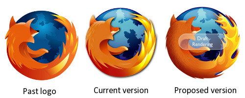
As it’s quite common to tweak/update software icon with every major release (Windows, Adobe Products, Internet Explorer and many more), Mozilla decided to do the same with its upcoming Firefox 3.5 release.
While earlier this month, the following logo version was proposed:
There are already few new variations floating around the web:
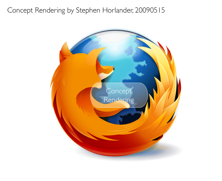
And the latest (which so far looks best):
So what do you think about new logos? Should they just use old one instead?
Thanks to Daniel Hendrycks for suggesting this article.
About (Author Profile)
Vygantas is a former web designer whose projects are used by companies such as AMD, NVIDIA and departed Westood Studios. Being passionate about software, Vygantas began his journalism career back in 2007 when he founded FavBrowser.com. Having said that, he is also an adrenaline junkie who enjoys good books, fitness activities and Forex trading.


I like the draft rendering the best.
All of them sucks… :P
I think, the Concept Rendering with the smooth round flames from the Draft Rendering would be the best.
FYI, he’s up to i10 now
http://blog.mozilla.com/faaborg/2009/05/30/new-firefox-icon-iteration-10-in-context/