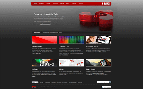
Opera.com – Refreshed Home Page
With the launch of Opera Unite, some changes were also made to opera home page design (black background + top pictures). It’s the first Opera design which I really enjoy looking to (white one was missing something), which is probably a good thing :-)
About (Author Profile)
Vygantas is a former web designer whose projects are used by companies such as AMD, NVIDIA and departed Westood Studios. Being passionate about software, Vygantas began his journalism career back in 2007 when he founded FavBrowser.com. Having said that, he is also an adrenaline junkie who enjoys good books, fitness activities and Forex trading.


Horrible jpeg compression deluxe. They would have been better of with two png images or a single sprited png if they want to speed things up a tiny bit.
You are right on that, they also seem to use graphics with background already painted (http://www.opera.com/bitmaps/home/campaign/0906unite/unite.jpg) instead of 1px width bg repeat + placing red logo on it.
Yea, that’s what I meant by two images :)
Oh well, there’s still time for them to fix it, hopefully they will.
1px wide images ISN’T the best way to do backgrounds. in fact it is better to use about 8-16px wide, and in case of ‘non-gradient’ background even greater
reason? slow computers render 1000*1px images much more slowly than 20*50px images. on slow computers and with certain browsers it is a HUGE difference.
but yes, it could heve been done better than that what opera did
Really? Didn’t knew that, thanks for the tip!
youre welcome :)
it is a bit ancient knowledge, because most modern webdevs dont even remember what 486 is, and for them p4 is ‘old’ :)
there is a lot of similar tricks, that are not relevant to someone with opera/safari/firefox and core2duo cpu, but they can be usefull when designing mobile-only sites.
That’s true, I had completely forgotten about that. 1px width just appears “simpler” I guess.
If they would use sprites they could even get away with ~408px in width, meaning the browser would only have to stitch together 2 or 3 gradients :D
Wow, all this whining over something completely irrelevant? I didn’t even notice (still don’t), and yes someone has to find some minor issue to whine about.
Geez.
It is completely relevant, this is the new design we are talking about.
How can you not notice the eyesore that is the “gradient” in the background, or the greenish blotches in the shadow?
It stands out like frikkin’ Mt. Everest!