Bad Web Browser UI Design Choices


And how to fix them. Part 1.
Although the web browser user interface keeps evolving, it looks like from time to time some random programmer (who has no design experience) decides to implement a feature and mess things up. And you know what the worst part is? It looks “fine” to him/her and change is approved by management who has no design experience as well. Or at least it looks this way.
Keep in mind, as Opera is my default web browser, it’s okay for me to find more UI flaws than in Internet Explorer, Firefox or Google Chrome.
Thankfully, those flaws will now be uncovered and humanity shall be saved. Furthermore, a “quick fix” is offered that should put management on the right track.
And if for some reason you don’t agree with the fixes, don’t worry; those are not the only ones. I am sure there are plenty of them. In fact, you could add few more web icons all over the UI and let reddit to take care of the problem…
Now, as my shockingly bad grammar and poor sense of humors got your attention, let’s jump in into the oblivion and uncover the truth.
Internet Explorer: Configuration
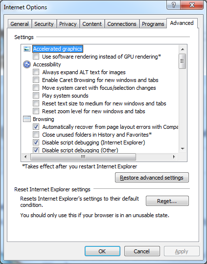
This one is probably not even worth mentioning. The “Internet Options” part in Microsoft’s web browser hasn’t been touched for more than a decade. It looks like this old, boring and outdated user interface is here to stay, at least for a while.
How to fix? Refresh it.
Firefox: No Zoom Indicator
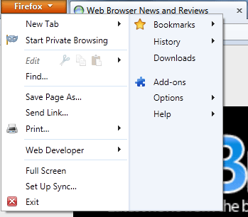
Let’s be honest. Firefox and Maxthon are the two web browsers that mostly have a consistent and friendly user interface for both new and experienced users. However, it doesn’t mean that those two are flawless.
What happens when you hit CTRL & + in Firefox or pretty much every other web browser? Magic. The problem with Firefox is that there is no way to quickly access the zoom indicator and you are left wondering, whether the images are just blurred or you are surfing with the zoom level of 110%.
How to fix? Include the zoom indicator.
Firefox: Over Saturated Menu Icon

So you have a menu on the left side of the web browser (just like 99% of all the software). There is an icon and you have to click it. Okay, we get it.
Now, what I don’t get is why you have to bring its tonality by such margin that it distracts from the web page content?
Thankfully, Opera has somewhat fixed the issue in the latest desktop version.

How to fix? Reduce the color saturation.
Opera Mobile and Opera Mini: Over Saturated Menu Icon
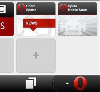
As previously mentioned, there is no need to distract people with the shiny bright icons, most of the users are not rappers and definitely not squirrels. Please stop it.
How to fix? Reduce the color saturation.
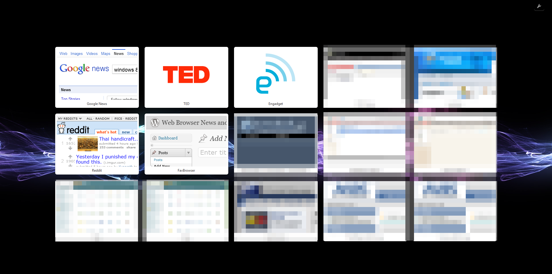
Opera: Speed Dial Borders
With the release of Opera 11.50, someone has decided to mess things up and add white colored borders around the thumbnail. While I understand the thoughts behind this decision (white background site icons), it’s far from a good implementation.
Good: Opera 11
Bad: Opera 11.50
As transparency is replaced with the white borders, it stands out way too much when using dark backgrounds.
How to fix? Bring back the transparency.
Opera: Save Password Dialog


Back in the old days, Opera had a neat password wand dialog while Firefox… Not so much. Then one day, Opera has decided to copy poor Firefox implementation while Firefox copied Opera’s.


Why is this bad idea? The user login area is rarely in the top right corner, where such dialog placement would be justified. Furthermore, the buttons are so small that it’s hard to click them without slowing down the cursor.
How to fix? Change the buttons size (see Google Chrome example below) or use the older implementation.

Picture sources: About, SparkMyLife
Bonus: A Lack of Screen Utilization
Although screen size resolutions are getting bigger and bigger (wider, at least), some of the web browser makers do not seem to get it.
Let’s take Google Chrome for example; here is the default interface screenshot:

Now image this on the 24″ display.
Width: 1920 px
Height: 1080 px
The width is almost twice the height, yet, some chose (not Google Chrome in this case) to sacrifice the height instead.
There is a difference between minimal and bad UI. Who really needs a 1920 pixels address bar? There is a plenty of space for your zoom indicators and other, widely used features. Why not use it more often, so users won’t have to click on the menu icons every once in a while.
How to fix? Use it!
That’s it folks. My point is: leave the coding to programmers and let the designers work on the user interface and browser usability.
Anything else? Let us know.
This is the first part of a series. Subscribe for the Part 2.
Comic source: Sebastian Kübeck’s Weblog.
About (Author Profile)
Vygantas is a former web designer whose projects are used by companies such as AMD, NVIDIA and departed Westood Studios. Being passionate about software, Vygantas began his journalism career back in 2007 when he founded FavBrowser.com. Having said that, he is also an adrenaline junkie who enjoys good books, fitness activities and Forex trading.

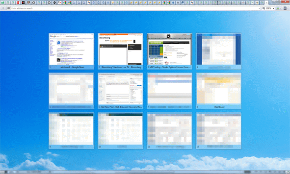


About last thing, Google designers have some program for removing Address Bar totally, you can see that on Chrome Canary (from about:flags…) :) I tested that, browsing without Address Bar was funny and looking good
I really hate how new Speed Dial Thumbails looks in new Opera.
If you are wondering, whether or not I have a little bit of the design experience to justify at least some of the claims, I do.
Some of my designs were/are (haven’t checked, really) used by AMD, NVIDIA and few other big guys.
P.S. Cell phone account hence the anonymous post :-)
I actually prefer the new way Opera prompts to remember passwords, it’s less intrusive than the old dialog. Not everyone wants to remember passwords, so for those that do it’s a halfway house solution that does not get in the way, but it’s there if you need it.
I also love the fact that in the IE configuration dialog you have both labels with ‘Enable …’ and ‘Disable …’. So in some cases you have to check a box to enable something (which makes sense), and in some cases you need to check a box to disable something (which is totally nuts).
Oh man you really wrote some shit here. I agree with your points but you should use lucid language. Dont mind but it feels like you wrote this rant while you were drunk or asleep or something! And did you ever think about how bad your post looks visually? So many images of varying sizes, it just makes a hash of everything. Please consider rewriting it. I was reading it in an rss reader and couldnt make head or tails out of it, so visited this post. You do a good job usually so keep writing :)
Regards
It’s not as easy as it sounds to find a quality, 5 year old web browser screenshots when Google Images is broken (or at least was).
Fixed the one with watermark.
NOOOO YOU CANT PUT BUTTONS IN CHROME!!! DON’T USE THE SPARE SPACE!!! Simply put the webpage there. The future is just the webpage and no buttons for the browser. Nobody wants boring interface, it’s all just the web. That’s why I use Chrome, it’s just the web and that’s it…
…is what I would say if I did use Chrome.
Bad interface, well, everyone has it, but I’d say Maxthon’s the prettiest and Firefox’s the most usable. The zoom indicator can be put in the toolbars, but it’s stupid that it’s not in the menu. Originally it was meant to be there, but as a result of the fast release cycle mozilla has now adopted (in response to Chrome’s), we may not see it in a very VERY long while. If ever. Rapid release cycle is a nightmare. Stuff that should have been in Firefox 4 will probably never see the light of day. Doorhangers aren’t implemented completely, tab modal dialogs aren’t implemented completely, account manager will probably take another year, the profile manager probably morat. People say Firefox 5 is Firefox 4. Well, it isn’t, but it’s almost, and the way things are looking Firefox 6 and Firefox 7 and Firefox 8 will probably be the same too. If you take a look at the only new thing is the developer tools, which are all very nice and interesting, but as a user I’d say projects like papercuts, electrolysis, home tab and panorama are way WAY more important than rapid release cycles that serve no one and are only a marketing ploy so stupid people think they are safer than before. That’s dumb.
Chrome is dumb and it’s an usability fail.
I reckon IE and chrome have it partially right. Opera is catching on (good on them) and firefox I do not care for frankly. < biggest Opera clone.
But my God. What did they do to Opera mini? It was much better before. Change the menu back PLEASE!
Guys, just try this out! It can be set from Opera 11.10 build 2092 on.
Speeddials that are completely transparent! ;-)
“Back in the old days, Opera had a neat password wand dialog while Firefox…”
When was it please? I have here nearly all mayor versions of Opera, no neat password dialog found
“The user login area is rarely in the top right corner”
You’re joking right?!!!
Most of web has the account/login area in the top right area! see Google, Facebook, IPB forums, and these are among hte most used websites…
And the old opera implementation was a nightmare, you had to click a button to be able able to interact with the webpage in any way, that sucked really.