“Featherweight” Designer, Henrik Helmers, Joins Opera
 Again.
With the release of Opera 11.50, Norwegian browser maker has introduced a new, Google Chrome like skin, which was a part of the “Featherweight” project. As explained back then, the “goal has been to make Opera as light, bright and user-friendly as possible—without sacrificing power or flexibility”
So what happened next? Long story short, he left the company in mid-2011 to work for the Norwegian tabloid Dagbladet.
Well, as noticed by one of our readers, he was not happy with the current employer and will be re-joining Opera and hopefully, continue working on the UI.
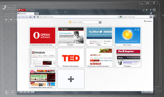
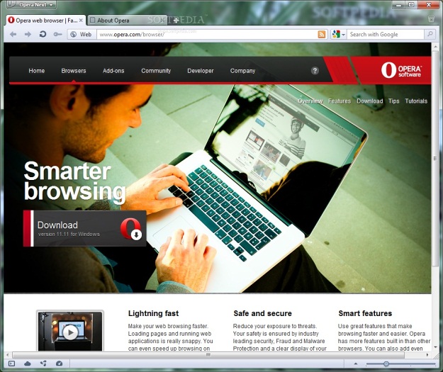
Want to see the difference between Opera 11.10 and Opera 11.50?

Opera 11.10 Beta

Opera 11.50 Beta
[Thanks, Hiram]
[Picture Source: Softpedia]
About (Author Profile)
Vygantas is a former web designer whose projects are used by companies such as AMD, NVIDIA and departed Westood Studios. Being passionate about software, Vygantas began his journalism career back in 2007 when he founded FavBrowser.com. Having said that, he is also an adrenaline junkie who enjoys good books, fitness activities and Forex trading.


I hope Featherweight results in a browser that looks different to the rest: Firefox, Sleipnir and Opera all look 99% the same while Chrome, Maxthon, IE look similar to each other as well. Safari 6 is yet to be released (2 weeks to go) so who knows what that’ll look like.
Opera’s current default skin is featherweight. it has been used since 11.50 beta.
“Featherweight” is the project name. It’s constantly ongoing.
Like I said, I hope it will result in Opera breaking the current trend of browser aesthetics.
Most of the “Themes” in 12 are memory hogging and result in system instability for less RAM users so Opera came to fix this with featherweight skin but somehow in v12 it added more artifacts than making it “Featherweight”
1) Go to C:>Program Files>Opera>Skin
2)Compare the size of the standard_skin of 12 to 11.50-11.54,11.60-1164
Another method is to use a compact/slim/lite skins that can be found in this link
http://my.opera.com/community/customize/skins/
I recommend this one
http://my.opera.com/community/customize/skins/info/?id=10162
It looks fugly in v12 but if you want more performance and workspace well its up to you.
your comparison images aren’t very fair. showing the blank speed dial versus showing the browser with a nice sleek webpage is obviously going to sway opinions.
Could someone tell me the differences? The only thing I see is the removal of button borders.
“Google Chrome like skin” I disagree.
Stop trying to make sound like everyone is copying Chrome…, this is getting tiresome.