“Leaking” Opera 10 Beta 3
Surprisingly, here is another Beta for you to play with. Although official Opera 10 Beta 3 announcement and changelog should be released tomorrow, there’s no need to wait, grab it now.

Windows version
Mac OS X version
Linux version (built for x86, x86-x64, ppc)
Solaris version (built for Intel and Sparc)
FreeBSD version (built for amd64 and Intel)
Thanks to DinuX for sending this.
Update
Changelog
[digg-reddit-me]
About (Author Profile)
Vygantas is a former web designer whose projects are used by companies such as AMD, NVIDIA and departed Westood Studios. Being passionate about software, Vygantas began his journalism career back in 2007 when he founded FavBrowser.com. Having said that, he is also an adrenaline junkie who enjoys good books, fitness activities and Forex trading.


Looks like it’s no longer possible to turn menu icon off.
I tought the next “beta” would be an RC. ;(
I can’t wait for 10 final anymoreeee!!! *-*
More beta releases = rock solid final release :-)
If you would like to use latest Opera build with no dots and possibility to hide menu bar, this is the latest one:
http://my.opera.com/desktopteam/blog/2009/07/21/new-snapshot-new-possibilities
I have the menu bar button. And I am using the beta 3 build.
http://img19.imageshack.us/img19/6021/58129492.png
But can you turn it off like in previous builds?
http://i28.tinypic.com/2ii7lvc.jpg
Turning off completely the access to the menu bar isn’t safe to end-users, they can simply never found the menu again!
I know people who would do that and never use Opera again after blaming the software because of this. These stupid users…. =X KKKKKKKKKKKKK
You can quickly access it by pressing Alt
I know it but imagine someone that don’t knows!
Yup, I guess something is left over from the folder or something, I’m not complaining… I like it a lot.
I still prefer the look from one of the previous snapshots, where the panel button and the new tab button are centered on the tab bar and the new tab button is attached to the last tab. I hope they change it back in the next few snapshots.
The new tab button STILL attached to the last tab in this beta, don’t you saw it? (not in that post picture, but I’m using and there it is)
Thanx, i havent tried it yet :). I saw the attachment in one of the replies and assumed it was still the same. I’m waiting for the official post on the desktop blog to download and try it :) .
I’m using the latest Beta after my previous version auto updated itself and i still find that the New Tab button is separate from the last tab and the gap keeps changing when you try to add a new tab. John Hicks had stated that it’s a bug and will be fixed soon, but it doesnt seem to be fixed yet. Or maybe its something to do with my setup?
Lol, A Firefox ad saying “You are settling for good when there’s awesome” , in a post about Opera :) . That’s a nice touch.
Well, apparently Mozilla pays more.
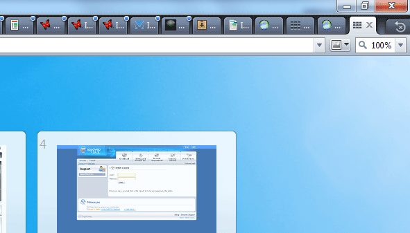
Opera10b3 is great. Tab Bar looks little messy and heavy too me. Is it possible to turn off blue dots?
Don’t know about B3 but it was not possible to disable them in older releases.
The new “Panels” and “New Tab” button are ugly, what was wrong with the old ones, also why the line below the address bar?
I think in their effort to polish the visuals they’ve spoiled it, it was pretty much perfect.
http://img30.imageshack.us/img30/8128/62015884.png
Agreed, they should reconsider older revisions of same skin.
Beta 3 is officially available for download today, not tomorrow :)
This was written yesterday :-)