New Firefox 4.0 Design Mock Ups Appear
With the upcoming Firefox 4.0 release, ChromaticPixel has yet again, revealed some of the upcoming design mock ups, which are quite impressive.
1. App Button
New handling of menu bar (similar to Microsoft’s Office) allows to save space and make it less complex
2. Toolbar Button Appearance
Lighter backgrounds and crisper graphics made navigation buttons more visible.
3. Location Bar
Updated visuals
4. Retain Separate Search Bar
5. Bookmarks Widget
“If the Bookmarks Toolbar is shown the Bookmarks Widget will appear there instead.”
Alternatives to Default Configurations
Tabs Under the Navigation Bar with Bookmarks Bar

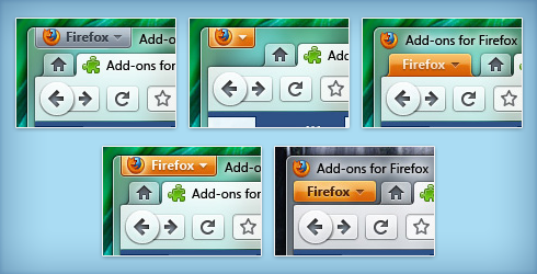
App Button Variations

Firefox 4 and Firefox 3.5 Comparison

[digg-reddit-me]
About (Author Profile)
Vygantas is a former web designer whose projects are used by companies such as AMD, NVIDIA and departed Westood Studios. Being passionate about software, Vygantas began his journalism career back in 2007 when he founded FavBrowser.com. Having said that, he is also an adrenaline junkie who enjoys good books, fitness activities and Forex trading.


I like it, finally FF is somewhat cute. :)
Yeah, it really is cute but it still remains behind Opera 10.5 :P Especially concerning use of resources and speed ;)
Yeah, I was just talking about the skin not the software. :P
if that green shining line over the individual tabs represent their loading status,then it is really cool…
yes, that green line on the top of the tab is supposed to indicate it’s loading status!
it’s very cool indeed :)
Is it me or Firefox 4 is kinda taking the same road in design as Opera 10.5?
While it’s true, similar mock ups were released half year ago or so, when no one knew how would Opera 10.5 look like
http://www.favbrowser.com/firefox-4-0-user-interface-screenshots-arrives/
Oh, I forgot about that..
Anyway, both of them are looking sweet. :)
Yeah, Chrome borrowed Opera’s tabs above the address bar and IE’s Aero at the top. Opera then invented the Opera button to replace the menu, and followed Chrome’s lead by removing the title bar. Now Firefox is basically following in all the other browsers’ footsteps. Borrowing the Aero at the top from IE, removing the title bar like Chrome, and putting the tabs above the address bar and adding the button in the top left like Opera.
Is Mozilla completely unable to actually invent anything themselves?
What an awful mess. They sure know how to ruin a great browser. :(
i like it, menu-less revolution started by chrome seems to gain a momentum. firefox removes lots of useless crap that cluttered its interface.
in general i like it and really hop for them to release it soon. like now firefox interface without serious modifications is full of useless stuff :/
their address bar is getting better and better.
Serious modifications? Removing the fav bar isn’t serious and so isn’t adding an extension that makes the menu bar behave on alt like vista/7 apps…
Not liking the lack of a top menu but as long as you can enable it I’ll keep using firefox — don’t really want it looking cute, want functionality
The similarity to Opera is really big and it is a good (future) decision :)
Replace this big, ugly, stupid back button. The size has nothing to do with frequency of usage of the button.
Let’s wait, how will 10.5 final look like :)
The similarity to Opera is really big and it is a good (future) decision :)
Replace this big, ugly, stupid back button. The size has nothing to do with frequency of usage of the button.
Let’s wait, how will Opera 10.5 final look like :)
If tabs are not on the very edge of the screen (as in Chromium), then placing them above the address bar doesn’t really make a difference
You still have to stop the mouse cursor precisely over the tab bar
The whole idea of putting tabs on the top is a bit like “Apple menu” on Mac OS – it allows the user to swing the cursor all the way up, and you don’t have to be (vertically) precise, because it will stop where it has to stop, as it cannot leave the screnn
There is an extension for Firefox which removes the title bar of the Window, but it doesn’t work 100% correct unfortunately.
Yes, if you want to use software you have to learn to use mouse. I hope this simple fact is clear for everyone.
Thinking this way …. Are you a billiard ball?
Are you asking me? I don’t quite get what your comment is referring to
they keep yell at folks of Opera because their decision to put tabs on top address bar (or address bar inside the tabs), for almost 10 years (or so…) they called it “silly” or “clumsy”
and what’s now? it’s almost 2010… and happy new year for all new browsers ui design
I’m starting to like the old Firefox,if you hide the bookmarks bar,the menu bar and the status bar and combine refresh and stop it looks very fancy