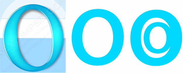
Opera Logo Updated

First it was Chrome, then Firefox. Now, it looks like Opera too has decided to update their logo and boy does it look familiar.
Considering that Opera 15 is a fresh start for the company, we’d prefer something fresh yet recognizable. Maybe something like these:

What do you guys think?
[Thanks, Rafael Luik]
[First Logo Source: PremiumPSD]
About (Author Profile)
Vygantas is a former web designer whose projects are used by companies such as AMD, NVIDIA and departed Westood Studios. Being passionate about software, Vygantas began his journalism career back in 2007 when he founded FavBrowser.com. Having said that, he is also an adrenaline junkie who enjoys good books, fitness activities and Forex trading.


This change took place 2-3 years ago…
Nope, there has been 1 revision since then: http://my.opera.com/desktopteam/blog/2012/04/23/opera-12-snapshot
And then it was overhauled again for Opera 15. Compare the logos.
Thats what he means, this aricle overlooks that revision and still looks at the 2008 version of the logo.
That third blue logo would be proper for O15+ – big “O” letter that has “C” inside it ;)
Thanks, made it almost by accident
Why are you comparing to that old logo, bypassing the 12.x logo?
It shares more in common with the old one
Now that you say it, the third one could be for “Opera Chrome”
After Opera 15, it should be “Ooops!”
I always hated the Opera logo, because it is similar to a zero and red, so it seems a Zero classification written on a school test.