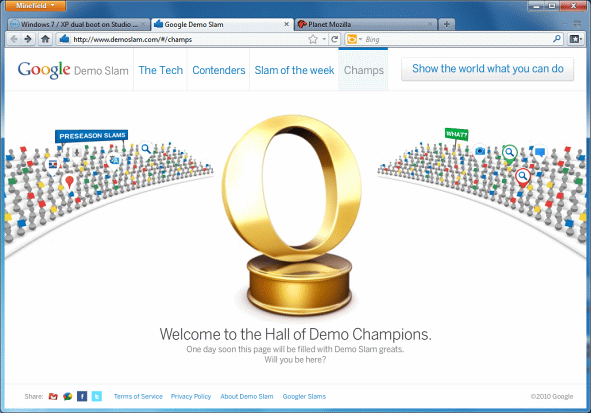
There’s a Golden Opera Logo in Google’s Demo Slam
Either I am into web browsers way too much or it’s actually an implementation of Opera Software logo.
Via Asa Dotzler blog.
About (Author Profile)
Vygantas is a former web designer whose projects are used by companies such as AMD, NVIDIA and departed Westood Studios. Being passionate about software, Vygantas began his journalism career back in 2007 when he founded FavBrowser.com. Having said that, he is also an adrenaline junkie who enjoys good books, fitness activities and Forex trading.


Epic FAIL, good job Google!
I think that is is not fail. I guess it is google acknowledgment of awesomeness of Opera Vs. Potate video
Congrats to Google for showing an unexpected degree of honesty.
Definitely looks like the John Hicks redesign of the Opera logo. At least looks like they took a cue from it – but the perspective on the right side of the O is off.
Sorry but John Hicks did not redesign the Opera Logo. It was done by Oleg Melnychuk ( i hope i got the name right ). John Hicks was involved in the UI redesign of Opera Desktop and Mini/Mobile though.
Well, for me the page is broken in Opera, so that is a big FAIL from me.
Ummm… as a big Opera fan, I have to say I lol’d
Sad, but honestly, a win for Google